 MEMBERSHIP LOGIN
 JOIN PRI
Brand Building
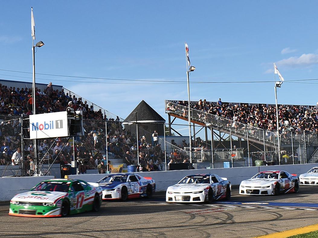
A racing livery showcases a team’s sense of style while also serving a vital marketing function. Its presentation can convey a lot about a competitor’s racing program without saying a word.
It’s no coincidence that some of the most iconic race cars in motorsports history are closely associated with their liveries. Machines like the Gulf GT40 and the Marlboro F1 cars of the 1980s endure in our collective minds not only because of their success on the track, but because of their unique, eye-catching aesthetics.
Race car graphics packages give competitors an opportunity to stand out in the field regardless of their position while also putting their sponsors front and center. But as these designers note, it’s the execution of these designs that determines whether or not they’re going to make a lasting impression.
Wrap Tech Signz
Dalton Cook of Wrap Tech Signz in Columbus, Georgia, said that the focal point for any race car graphics package should be the number and the sponsors. “That’s all about contrast—the more contrast you can create, the more your eye is drawn to the elements that are emphasized by that contrast. And layering plays a big part there. Layers allow you to plot out how you’re going to create that contrast.”
Cook said that digital printing has given designers increased freedom in that regard, allowing for much more intricate layouts than physically layered vinyl does. But there’s also a point where complexity can work against the core goals of the design. “Digital printing lets you just add and add to a design. The problem is that the more you pile on to a design, the more you start to blur the focus of it. Less ultimately feels like more because it ends up looking cleaner.”
That’s why color choice is a key element in the design process. “Maximum contrast is going to be white with a black outline,” he said. “Of course, other colors can look good as well, but they won’t be as visible from a distance. So you have to balance that out with the style and appearance that the client wants. That’s why so many commercial signs look relatively plain—they’re going for maximum visibility.”
Strategic use of shadowing can also help specific elements of a design stand out. “Soft shadows give the design a sense of dimensional depth,” said Cook. “That can make something look like it’s raised up in comparison to the features around it. If you do it correctly, it can create this ‘glow’ effect that really emphasizes the contrast that you’re creating.”
From there it’s about adding creative flourishes in order to give the design some personality. When they are done right, these elements can provide benefits that go beyond maximizing sponsorship visibility. “It can help create an identity for the car and the team, and it can say a lot about how professional their program is,” he emphasized. “That can help a team attract new fans, new sponsors, and bring in other opportunities. Your performance on track is one part of it, and your appearance is another. All of it serves as a description of you as an individual. So you have to treat every design like it’s going on a car in top-tier competition.”
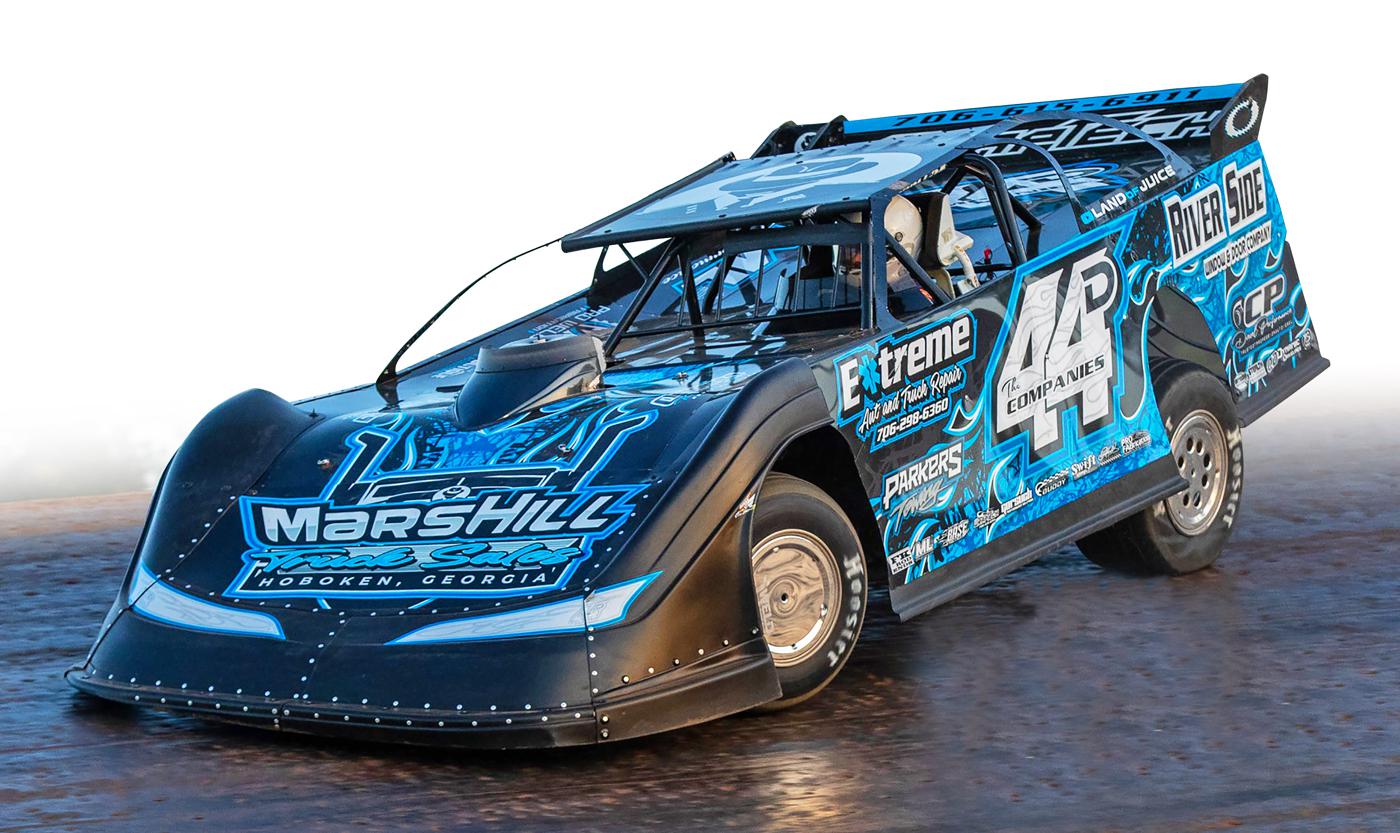
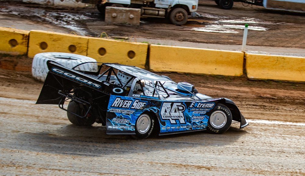
Cook cited this graphics package that he created for a Super Late Model car as a good example of these principles. “The reason that I really like this particular design is because it delivers a little bit of everything. It’s clean and easy to read from a distance, but as you get closer to it, you start to see a lot of additional details that give it that ‘wow factor.’ And while the car is essentially blue, black, and white, you get the perception that there’s a lot more than that going on because of the various shades, fading, and texturing.”
For this design, Cook also used flames to provide some additional visual flair, but he said that it’s an effect that comes with some significant aesthetic risk. “Flames can look really good, or they can look really bad. Part of the challenge there is that I didn’t have a ton of extra room to work with, and in order for flames to look good, you have to be able to see a lot of the different components of the flame—the way it curves, the points, and the general flow of it. In some ways I had to work backwards on this one; I put the logos and everything else on the car before I began working on getting the flame layout because I wanted to make sure it would look right around those elements.”
While he said that a customer’s initial reaction can be a good measure of whether or not a design is effective, time is usually the ultimate judge. “Marketing is about establishing a brand identity,” confirmed Cook. “If a team has a specific look for their car and then they decide to change everything up for the following season, they’re not really solidifying that brand identity. The end game here is to design something that the teams don’t want to change.”
FireStorm Graphix
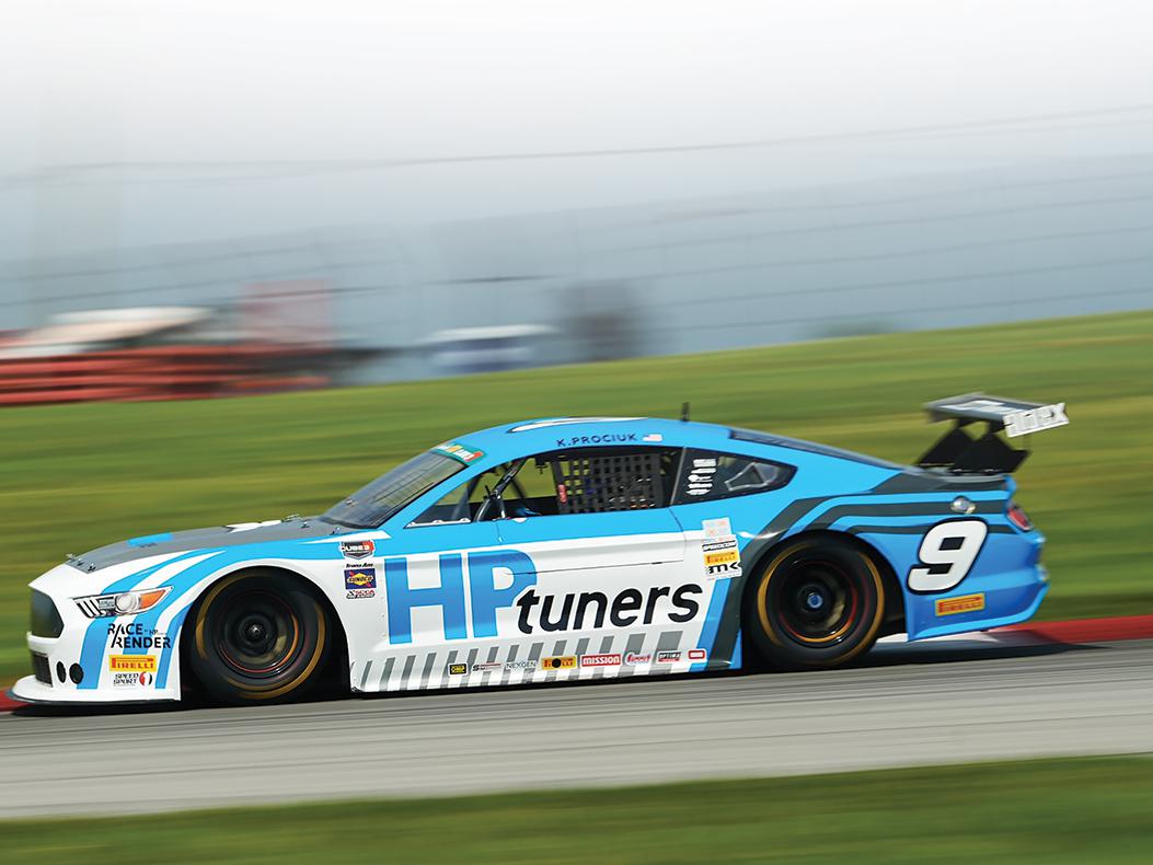
Since visual impact is one of the main priorities for any race car graphics package, Matt Lachance of FireStorm Graphix in Nashua, New Hampshire, said he and his team usually work with their clients to establish a color palette in the early stages of a project and develop the design from there. “We don’t like to have too many colors on a car—it starts to look like a bowl of Froot Loops,” he quipped.
“Limiting the range of colors allows us to find a few that will complement each other and make that visual impact that we’re looking for. If you look at some of these wraps—especially on dirt track cars—the ones that stand out tend to be color coordinated from front to back. A good design will allow the car to stand out in the field, and visually striking graphics packages will get noticed. That’s good for the existing sponsors, and it can help generate interest from new ones as well. If a design is well executed, it can add a certain level of professionalism to the look of a team.”
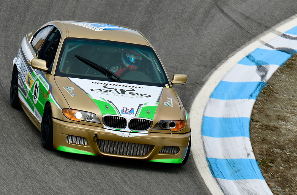
Lachance cited a design that FireStorm created for a customer who is campaigning a BMW E46 coupe in a club road racing series in Canada. “He came to us and said, ‘The car is gold, and I don’t want to wrap the whole thing.’ So the next step was to figure out what colors would complement that base color.” The client also noted that he wanted some green elements in the design, so the team at FireStorm decided to incorporate some gray to balance things out—a neutral tone that wouldn’t clash with the other hues.
He said that FireStorm was given more or less free rein in terms of the general design of the graphics package, and most of the tweaks that were made during development were focused on bringing attention to the sponsors. “There was a bit of work involved to incorporate the R and L of his main sponsor’s logo based on their original design, and he added a few sponsors along the way that we integrated into the design of the wrap as well. The OXBO logo on the hood is a good example of that—there wasn’t a hood graphic planned originally, so we just needed to find a way to integrate that logo and a graphic in a way that blended in with the rest of the design. The key was to integrate it in a way that made it look like it was always part of the larger package while also making the logo prominent enough to be easily read from a distance.”
When it comes to design, sweating the details tends to pay off. In the case of this E46, the effectiveness of the graphics package brought a tangible, direct benefit to the client’s racing program. “He came back to tell us that his sponsors were so pleased with the look of the car, and the exposure that it offered for their businesses, that they decided to sign on for another season. So it’s clear that the design had a positive impact for everyone involved.”
RVA Graphics and Wraps
For the designers at RVA Graphics and Wraps in Richmond, Virginia, each motorsports-related project starts with a conversation with the client about what they’re looking to achieve with their branding. “Everybody’s goal is a little bit different in that regard,” said Caitlin Olszewski. “It could be a traditional sponsorship, a charity they’re looking to bring attention to, or some other kind of messaging. And you might have different goals for the design on different parts of the car, so it’s important to really get a sense of what the team is trying to accomplish.”
From there the discussion shifts to whether the client wants the entire car wrapped or just sections of it. “With a full wrap you really have to consider the body lines of the car,” she noted. “When I’m watching a race, it’s obvious to me which teams took that approach and which ones just adapted a pre-existing paper template. At the end of the day, a template just isn’t going to stand out in the crowd.”
Effective race car graphics packages, according to Olszewski, can not only make a team appear more professional, they can establish an aesthetic with a lasting identity. “If you think about Jeff Gordon’s car, you automatically think the DuPont logo and the color scheme. That branding longevity is incredibly valuable to a sponsor.”
That’s why RVA usually tries to integrate sponsor logos in a way that makes them a fundamental part of the overall design. “That prevents it from looking like an afterthought,” she said. “So it’s really about the placement and balance of those various elements, and we more or less work in tiers across the vehicle in order to make it look like one cohesive design.”
The target audience comes into play here, too. “There are people who’re going to see the car from the stands, and there are also people who’re going to get up close and personal with the car. So you have to be strategic about placement in terms of what is going to be readable on the car in different contexts,” she added.
While font choice plays heavily into legibility, the elements surrounding it can be a factor as well. “You have to make sure that you have complementary colors, and you have to be measured about elements like stripes, gradients, and halftone effects if there’s going to be text on top of it. You have to mute the background and get rid of the noise to ensure that the text can be read quickly. High contrast equals high visibility.”
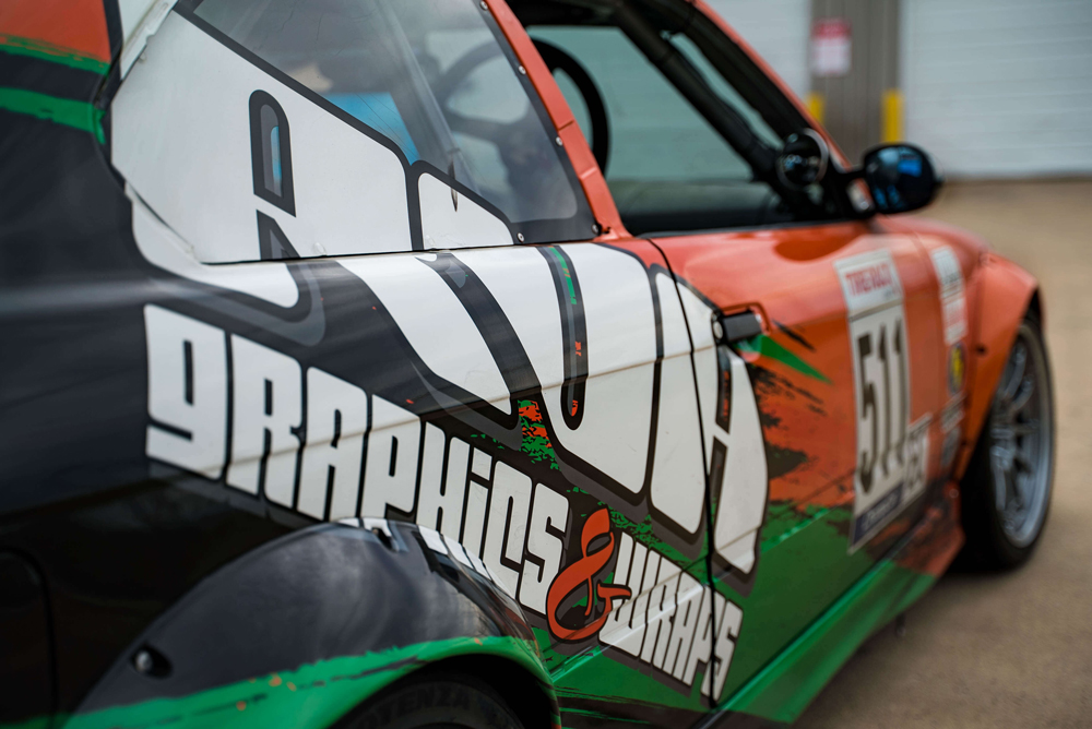
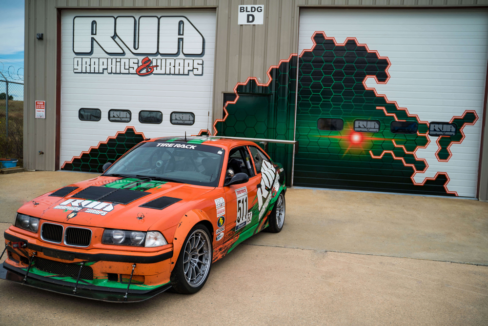
Olszewski pointed to the design on this RVA-sponsored E30 BMW endurance racer as an example. “Right away you can see a lot of elements that associate it with our brand—the orange-green-black color scheme, along with the large logos on the side panels that are positioned diagonally to draw your eye in. That’s prime real estate because that’s what spectators are going to see the most of as the cars travel around the track.”
Using the car’s character lines as a design guide makes the graphics look tailored to that particular body, and that distinctive aesthetic naturally draws more attention to the car—along with specific elements on it. “The stripes help to highlight those lines,” she explained. “For example, on the hood there are two sets of stripes that follow the character lines and draw your eye to the RVA Graphics logo. Design elements like that really help the car get noticed out on track. People frequently come up to us at races and ask about how they can get help with their graphics packages after they’ve seen the car. It’s a great compliment.”
SOURCES
FireStorm Graphix
firestormgraphix.com
RVA Graphics and Wraps
rvagfx.com
Wrap Tech Signz
facebook.com/WrapTechSignz/